Colour Keys
The Art Director and I worked closely together on the colour keys after design was mostly finished. We did roughly half the total keys each.
These keys were painted over screencaps from greyscale playblasts. As most of the main characters had groom which doesn’t show up in the playblasts, the characters themselves needed significant repainting.

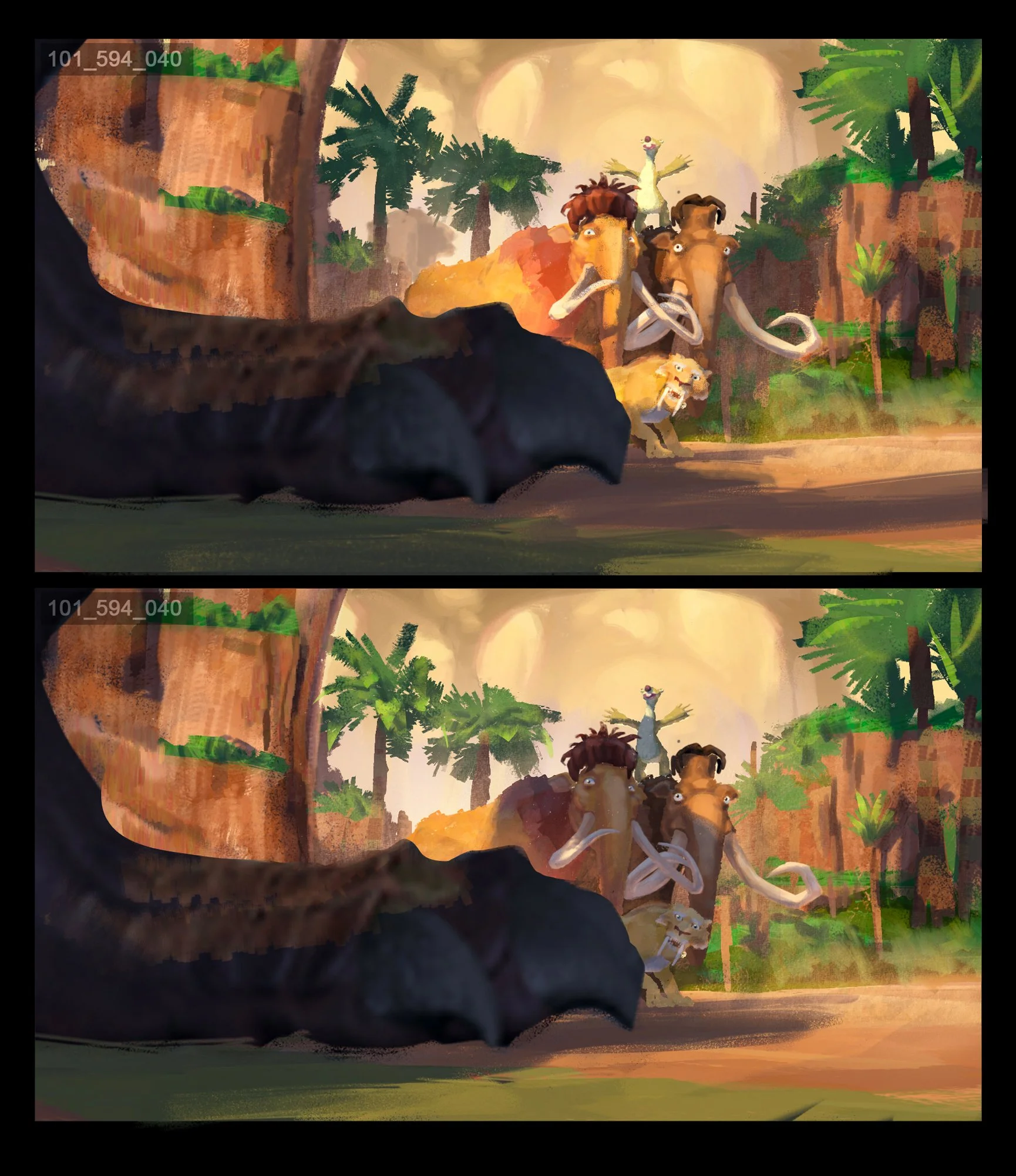
As the schedule was tight, I would often offer multiple options at the same time for a scene. Especially for scenes where the tone was a bit more interpretable and could be read several ways.

Here we see a consistent time of day, but options where the light directions is reversed.
This simple change in light position changes this interaction from friendly to thratening, before we even see any acting or hear any diologue.

Another example where the light direction affects the tone of the scene, and most importantly the power dynamic between the two characters as we cut back and forward in a sequence of dialogue.

Here we see Buck telling a dramatic story in front of his fireplace.
Different exposures and light colours offer a playful rnostalgic feeling, and a much more dramatic, ominous tone.
Another example of a shot where lighting choices can have a strong effect on the narrative, long after layout has been locked down.
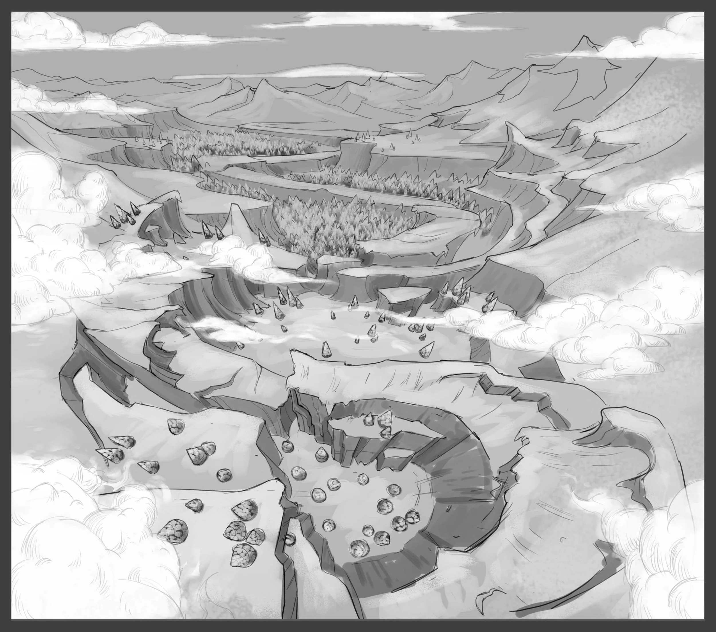
Matte Painting
I created multiple matte paintings for the show, but the most featured one was this big tilting wide shot during the opening act.
Matte Paintings like this can’t be created from photo assets or they will not match the stylised look and shape language of the property. Therefore the most featured matte paintings were sometimes created by the art leads rather than the DMP team.
At right was the initial sketch, which had a stronger composition as a still image. However once seen in shot, the director pushed for a layout that was more dynamic in motion and really pushed the depth as the camera tilted up.